


0.自定义css
将以下css放入子比自定义css样式,或者将css保存至网站目录引入
/*春节灯笼*/
.deng-box,
.deng-box1,
.deng,
.deng1,
.deng2,
.deng3,
.deng4,
.deng5,
.deng6,
.deng7,
.deng8 {
transform: scale(0.9); /* 90% of the original size */
}
.deng-box {
position: fixed;
top: -30px; /* 90% of 18px */
right: -10px; /* 90% of -20px */
z-index: 999;
}
.deng-box1 {
position: fixed;
top: -30px; /* 90% of 18px */
left: -10px; /* 90% of 2px */
z-index: 999;
}
.deng-box1 .deng,
.deng {
position: relative;
width: 108px; /* 90% of 120px */
height: 81px; /* 90% of 90px */
margin: 45px; /* 90% of 50px */
background: #d8000f;
background: rgba(216, 0, 15, 0.8);
border-radius: 50% 50%;
-webkit-transform-origin: 50% -81px; /* 90% of -90px */
-webkit-animation: swing 5s infinite ease-in-out;
box-shadow: -4.5px 4.5px 40.5px 3.6px rgba(250, 108, 0, 1); /* Adjusted for scaling */
}
.deng-a {
width: 90px; /* 90% of 100px */
height: 81px; /* 90% of 90px */
background: #d8000f;
background: rgba(216, 0, 15, 0.1);
margin: 10.8px 7.2px 7.2px 7.2px; /* 90% of original values */
border-radius: 50% 50%;
border: 1.8px solid #dc8f03; /* 90% of 2px */
}
.deng-b {
width: 40.5px; /* 90% of 45px */
height: 81px; /* 90% of 90px */
background: #d8000f;
background: rgba(216, 0, 15, 0.1);
margin: -3.6px 7.2px 7.2px 23.4px; /* Adjusted for scaling */
border-radius: 50% 50%;
border: 1.8px solid #dc8f03; /* 90% of 2px */
}
.xian {
position: absolute;
top: -18px; /* 90% of -20px */
left: 54px; /* 90% of 60px */
width: 1.8px; /* 90% of 2px */
height: 18px; /* 90% of 20px */
background: #dc8f03;
}
.shui-a {
position: relative;
width: 4.5px; /* 90% of 5px */
height: 18px; /* 90% of 20px */
margin: -4.5px 0 0 53.1px; /* Adjusted for scaling */
-webkit-animation: swing 4s infinite ease-in-out;
-webkit-transform-origin: 50% -40.5px; /* 90% of -45px */
background: #ffa500;
border-radius: 0 0 4.5px 4.5px; /* 90% of 5px */
}
.shui-b {
position: absolute;
top: 12.6px; /* 90% of 14px */
left: -1.8px; /* 90% of -2px */
width: 9px; /* 90% of 10px */
height: 9px; /* 90% of 10px */
background: #dc8f03;
border-radius: 50%;
}
.shui-c {
position: absolute;
top: 14.4px; /* 90% of 16px */
left: -1.8px; /* 90% of -2px */
width: 9px; /* 90% of 10px */
height: 31.5px; /* 90% of 35px */
background: #ffa500;
border-radius: 0 0 0 4.5px; /* Adjusted for scaling */
}
.deng:before {
position: absolute;
top: -6.3px; /* Adjusted for scaling */
left: 26.1px; /* Adjusted for scaling */
height: 10.8px; /* Adjusted for scaling */
width: 54px; /* Adjusted for scaling */
content: " ";
display: block;
z-index: 999;
border-radius: 4.5px 4.5px 0 0; /* Adjusted for scaling */
border: solid 0.9px #dc8f03; /* 90% of 1px */
background: #ffa500;
background: linear-gradient(to right, #dc8f03, #ffa500, #dc8f03, #ffa500, #dc8f03);
}
.deng:after {
position: absolute;
bottom: -6.3px; /* Adjusted for scaling */
left: 9px; /* Adjusted for scaling */
height: 10.8px; /* Adjusted for scaling */
width: 54px; /* Adjusted for scaling */
content: " ";
display: block;
margin-left: 18px; /* Adjusted for scaling */
border-radius: 0 0 4.5px 4.5px; /* Adjusted for scaling */
border: solid 0.9px #dc8f03; /* 90% of 1px */
background: #ffa500;
background: linear-gradient(to right, #dc8f03, #ffa500, #dc8f03, #ffa500, #dc8f03);
}
.deng-t {
font-family: 鍗庢枃琛屾シ, Arial, Lucida Grande, Tahoma, sans-serif;
font-size: 2rem; /* 90% of 3.2rem */
color: #dc8f03;
font-weight: bold;
line-height: 76.5px; /* Adjusted for scaling */
text-align: center;
}
.night .deng-t,
.night .deng-box,
.night .deng-box1 {
background: transparent !important;
}
@-moz-keyframes swing {
0% {
-moz-transform: rotate(-9deg); /* Adjusted for scaling */
}
50% {
-moz-transform: rotate(9deg); /* Adjusted for scaling */
}
100% {
-moz-transform: rotate(-9deg); /* Adjusted for scaling */
}
}
@-webkit-keyframes swing {
0% {
-webkit-transform: rotate(-9deg); /* Adjusted for scaling */
}
50% {
-webkit-transform: rotate(9deg); /* Adjusted for scaling */
}
100% {
-webkit-transform: rotate(-9deg); /* Adjusted for scaling */
}
}
/* 鐢ㄤ簬杈冨皬灞忓箷锛堜緥濡傜Щ鍔ㄨ澶囷級鐨勫獟浣撴煡璇� */
@media only screen and (max-width: 768px) {
.deng-box,
.deng-box1,
.deng,
.deng1,
.deng2,
.deng3,
.deng4,
.deng5,
.deng6,
.deng7,
.deng8 {
transform: scale(0.7); /* 70% of the original size */
}
.deng-box {
position: fixed;
top: 18px;
right: -20px;
z-index: 1;
}
.deng-box1 {
position: fixed;
top: 18px;
left: -20px;
z-index: 1;
}
.deng-box1 .deng,
.deng {
position: relative;
width: 84px; /* 70% of 120px */
height: 63px; /* 70% of 90px */
margin: 35px; /* 70% of 50px */
background: #d8000f;
background: rgba(216, 0, 15, 0.8);
border-radius: 50% 50%;
-webkit-transform-origin: 50% -70px; /* 70% of -100px */
-webkit-animation: swing 5s infinite ease-in-out;
box-shadow: -5px 5px 35px 4px rgba(250, 108, 0, 1); /* Adjusted for scaling */
}
.deng-a {
width: 70px; /* 70% of 100px */
height: 63px; /* 70% of 90px */
background: #d8000f;
background: rgba(216, 0, 15, 0.1);
margin: 8px 5.6px 5.6px 5.6px; /* 70% of original values */
border-radius: 50% 50%;
border: 1.4px solid #dc8f03; /* 70% of 2px */
}
.deng-b {
width: 31.5px; /* 70% of 45px */
height: 63px; /* 70% of 90px */
background: #d8000f;
background: rgba(216, 0, 15, 0.1);
margin: -2.8px 5.6px 5.6px 18.2px; /* Adjusted for scaling */
border-radius: 50% 50%;
border: 1.4px solid #dc8f03; /* 70% of 2px */
}
.xian {
position: absolute;
top: -14px; /* 70% of -20px */
left: 42px; /* 70% of 60px */
width: 1.4px; /* 70% of 2px */
height: 14px; /* 70% of 20px */
background: #dc8f03;
}
.shui-a {
position: relative;
width: 3.5px; /* 70% of 5px */
height: 14px; /* 70% of 20px */
margin: -3.5px 0 0 41.3px; /* Adjusted for scaling */
-webkit-animation: swing 4s infinite ease-in-out;
-webkit-transform-origin: 50% -31.5px; /* 70% of -45px */
background: #ffa500;
border-radius: 0 0 3.5px 3.5px; /* 70% of 5px */
}
.shui-b {
position: absolute;
top: 9.8px; /* 70% of 14px */
left: -1.4px; /* 70% of -2px */
width: 7px; /* 70% of 10px */
height: 7px; /* 70% of 10px */
background: #dc8f03;
border-radius: 50%;
}
.shui-c {
position: absolute;
top: 12.6px; /* 70% of 18px */
left: -1.4px; /* 70% of -2px */
width: 7px; /* 70% of 10px */
height: 24.5px; /* 70% of 35px */
background: #ffa500;
border-radius: 0 0 0 3.5px; /* Adjusted for scaling */
}
.deng:before {
position: absolute;
top: -4.9px; /* Adjusted for scaling */
left: 20.3px; /* Adjusted for scaling */
height: 8.4px; /* Adjusted for scaling */
width: 42px; /* Adjusted for scaling */
content: " ";
display: block;
z-index: 999;
border-radius: 3.5px 3.5px 0 0; /* Adjusted for scaling */
border: solid 0.7px #dc8f03; /* 70% of 1px */
background: #ffa500;
background: linear-gradient(to right, #dc8f03, #ffa500, #dc8f03, #ffa500, #dc8f03);
}
.deng:after {
position: absolute;
bottom: -4.9px; /* Adjusted for scaling */
left: 7px; /* Adjusted for scaling */
height: 8.4px; /* Adjusted for scaling */
width: 42px; /* Adjusted for scaling */
content: " ";
display: block;
margin-left: 14px; /* Adjusted for scaling */
border-radius: 0 0 3.5px 3.5px; /* Adjusted for scaling */
border: solid 0.7px #dc8f03; /* 70% of 1px */
background: #ffa500;
background: linear-gradient(to right, #dc8f03, #ffa500, #dc8f03, #ffa500, #dc8f03);
}
.deng-t {
font-family: 鍗庢枃琛屾シ, Arial, Lucida Grande, Tahoma, sans-serif;
font-size: 1.8rem; /* 70% of 3.2rem */
color: #dc8f03;
font-weight: bold;
line-height: 59.5px; /* Adjusted for scaling */
text-align: center;
}
.night .deng-t,
.night .deng-box,
.night .deng-box1 {
background: transparent !important;
}
@-moz-keyframes swing {
0% {
-moz-transform: rotate(-7deg); /* Adjusted for scaling */
}
50% {
-moz-transform: rotate(7deg); /* Adjusted for scaling */
}
100% {
-moz-transform: rotate(-7deg); /* Adjusted for scaling */
}
}
@-webkit-keyframes swing {
0% {
-webkit-transform: rotate(-7deg); /* Adjusted for scaling */
}
50% {
-webkit-transform: rotate(7deg); /* Adjusted for scaling */
}
100% {
-webkit-transform: rotate(-7deg); /* Adjusted for scaling */
}
}
}
1.自定义底部html代码
将以下代码放入子比自定义底部html代码即可。
<!-- 灯笼1 -->
<div class="deng-box">
<div class="deng">
<div class="xian"></div>
<div class="deng-a">
<div class="deng-b"><div class="deng-t">福</div></div>
</div>
<div class="shui shui-a"><div class="shui-c"></div><div class="shui-b"></div></div>
</div>
</div>
<!-- 灯笼2 -->
<div class="deng-box1">
<div class="deng">
<div class="xian"></div>
<div class="deng-a">
<div class="deng-b"><div class="deng-t">福</div></div>
</div>
<div class="shui shui-a"><div class="shui-c"></div><div class="shui-b"></div></div>
</div>
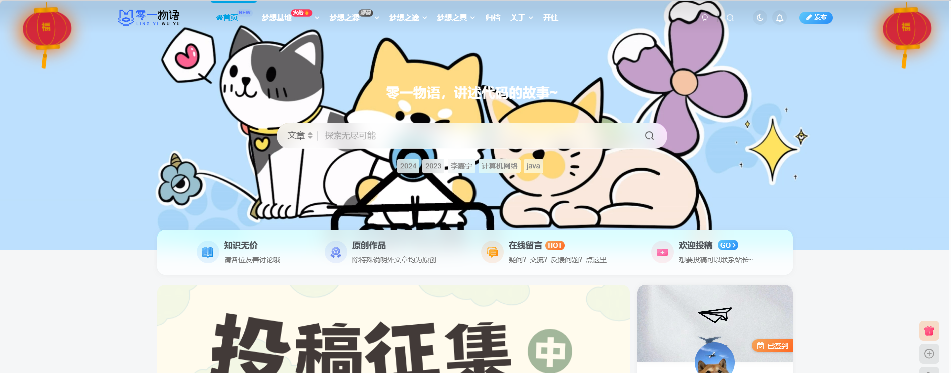
</div>2.效果
![图片[1]-即将2024年春节了,为你的子比主题添加两个灯笼吧!](https://www.docn.net/cosfs//2024/01/20240106181048830-image-1024x402.png)
![图片[2]-即将2024年春节了,为你的子比主题添加两个灯笼吧!](https://www.docn.net/cosfs//2024/01/20240106181237758-364dd74b534554247b3e9f1b309e99d-461x1024.jpg)
特别感谢:
© 版权声明
- 本博客所拥有的文章除特别声明外,均默认采用 CC BY 4.0 许可协议。
- 文章部分内容可能来源于公共网络,如有侵权,请联系博主在核实后进行修改或删除。
THE END


暂无评论内容